




A good e-commerce homepage does three jobs, fast: it explains why someone should buy from you, helps them find what they want, and builds enough trust to make the first click easy. Below is a practical guide to the structure, content, and UX details that consistently work.
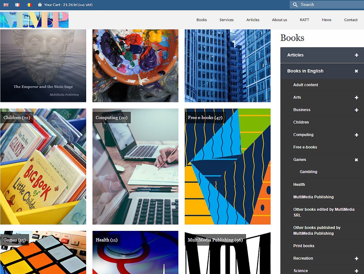
Above the fold: clarity beats clever
Goal: In 5 seconds, a new visitor should know what you sell, for whom, and why you’re different.
- Hero headline: Clear value proposition (“Premium running shoes, delivered free in 2 days”) + a subhead with your differentiator (materials, warranty, price, selection).
- Primary CTA: One action that matches visitor intent (e.g., “Shop Men,” “Shop Women,” “New Arrivals”). Keep it singular.
- Confidence boosters: Compact proof next to the CTA—“4.8★ from 12,000 reviews,” “Free 30-day returns,” “Secure checkout.”
- Mobile first: Ensure the headline, one image, and one CTA render above the fold on a mid-range phone.
Avoid: Rotating carousels (low engagement, accessibility issues), autoplay video with sound, or multiple competing CTAs.
Navigation that orients—not overwhelms
Goal: Let shoppers predict where a click will land.
- Top-level IA: 5–7 clear categories max. Use shopper language, not org jargon.
- Mega menus: Only if you have breadth—group by intent (Use, Collection, Brand), not internal teams.
- Utility links: Search, Account, Cart, Help/Contact, and Returns should be consistent and always visible.
- Sticky nav on scroll (mobile and desktop): Prevents “where am I?” moments.
Avoid: Deep nesting on mobile, mystery meat icons without labels, or burying Help/Returns.
Search that actually finds
Goal: Make the search box the fastest path to products.
- Prominent search bar with placeholder guidance (“Search ‘black midi dress’…”).
- Autosuggest for products, categories, and quick links (e.g., “Track order”).
- Tolerance for typos and synonyms (“sneekers” → “sneakers”; “hoodie” ~ “sweatshirt”).
- Recent and popular searches to reduce friction.
Merchandising that mirrors shopper intent
Goal: Show the right selection without decision fatigue.
- Featured modules: “New,” “Best sellers,” “Back in stock,” “Seasonal picks.”
- Personalization (lightweight): Recently viewed; geo-aware messaging (shipping times, currency); return visitors see “Continue where you left off.”
- Editorial curation: Small, scannable story cards (“How to choose a trail shoe”) that lead into shoppable content.
Avoid: Overpersonalization that feels creepy or hides core navigation.
Trust, proof, and policies (make risk feel low)
Goal: Remove purchase anxiety early.
- Social proof: Storewide rating, counts of happy customers, press badges (used sparingly), and UGC snapshots.
- Service policies: Plain-language shipping, returns, warranty. Link from the hero and footer; summarize in a single line near CTAs.
- Payments and security: Show major payment marks (including wallets/BNPL) and security messaging near the cart icon or footer.
Microcopy that helps:
- “Free 30-day returns. Prepaid label included.”
- “Ships next business day from EU warehouse.”
- “No duties for EU orders. Prices include VAT.”
Performance and UX hygiene
Goal: Fast, stable, touch-friendly.
- Speed: Target Core Web Vitals—LCP ≤ 2.5s, CLS ≤ 0.1, INP ≤ 200ms.
- Images: Responsive, modern formats (AVIF/WebP), real-world device testing on 3G/4G.
- Touch targets: ≥ 44px tap areas, visible focus states, no content shifting.
- Pop-ups: Delay newsletter popups until intent (scroll depth, exit intent). Always provide a visible close.
Accessibility and inclusivity (also good for SEO)
Goal: Everyone can browse and buy.
- Contrast: WCAG 2.1 AA (4.5:1 for body text).
- Structure: One H1, logical headings, descriptive alt text.
- Keyboard and screen reader support: Test nav, menus, and modals; avoid “keyboard traps.”
- Language and localization: Correct
langattributes; currency, sizing, date formats by locale.
Footer that pulls its weight
Goal: Secondary navigation and reassurance.
- Quick links: Full sitemap of categories, Support/Returns, Size guides, Gift cards, Careers.
- Legal and compliance: Terms, Privacy, Cookie settings, Company info (address, VAT/company number).
- Contact options: Chat, email, phone hours; response SLAs if you have them.
- Store locator if you’re omnichannel.
Content that sells without shouting
Goal: Earn attention with relevance.
- Short, scannable copy with line-length under ~75 characters.
- Consistent tone: Helpful, specific, benefit-led.
- Photography that tells use-case: Real context > sterile pack shots for the homepage.
Measurement and iteration
Goal: Keep what works, fix what doesn’t.
- Essential events: Clicks on primary CTAs, search submissions, menu opens, scroll depth, module CTRs.
- Cohorts: First-time vs returning, mobile vs desktop.
- A/B testing ideas: Value prop variants, CTA label/placement, “Best sellers” vs “New arrivals,” trust badge placement.
- Qual: Run 5-second tests and session replays; read on-site search logs for missed intent.
A simple “HOMEPAGE” checklist
- H — Headline and value prop: Clear, specific, above the fold.
- O — Orientation: Clean nav, visible search, predictable menus.
- M — Merchandising: New, best, seasonal; tasteful personalization.
- E — Evidence: Ratings, reviews, policies, press used sparingly.
- P — Performance: Fast load, stable layout, smooth input.
- A — Accessibility and assurance: WCAG-friendly, easy returns and support.
- G — Guidance: Helpful content, size guides, gift ideas, store locator.
- E — Experimentation: Track, test, and iterate continuously.
Common pitfalls to avoid
- Carousels that auto-rotate and hide key messages.
- Promo overload: more than one major message above the fold.
- Hiding shipping/returns until checkout.
- Dark patterns (pre-checked boxes, deceptive timers).
- Desktop-first layouts that break on mid-range phones.
A model homepage layout (in words)
- Sticky header: Logo (home), Categories, Search bar, Help, Account, Cart.
- Hero strip: Value prop + single CTA + 1–2 trust cues.
- Row 1: “New arrivals” (4–6 SKUs).
- Row 2: “Best sellers” with quick-add.
- Row 3: Seasonal/occasion guide (editorial card → shoppable PLP).
- Row 4: Social proof band (UGC, rating, policy highlights).
- Footer: Secondary nav, contact, payments, legal.
Final thought
A great e-commerce homepage is opinionated: it decides what most shoppers need first and makes that path unmistakable. Start with clarity, reduce risk, keep it fast, and iterate with real data.


Management, analize, planuri și strategii de afaceri
Ghidul indispensabil pentru înțelegerea și aplicarea celor mai eficiente tehnici și strategii de management.

Inteligența competitivă – Concept – Studii
Inteligența competitivă: instrumentul esențial pentru succesul în afaceri

Marketing ecologic în Uniunea Europeană
Într-o economie globalizată, nivelurile medii de consum sunt în creştere ca urmare: a populaţiei mondiale în creştere; sporirii numărului de consumatori cu venituri medii şi mici şi extinderii unei culturi generale a consumului; sistemelor economice din societăţile industrializate bazate pe … Read More
Discover more from MultiMedia
Subscribe to get the latest posts sent to your email.




Leave a Reply